

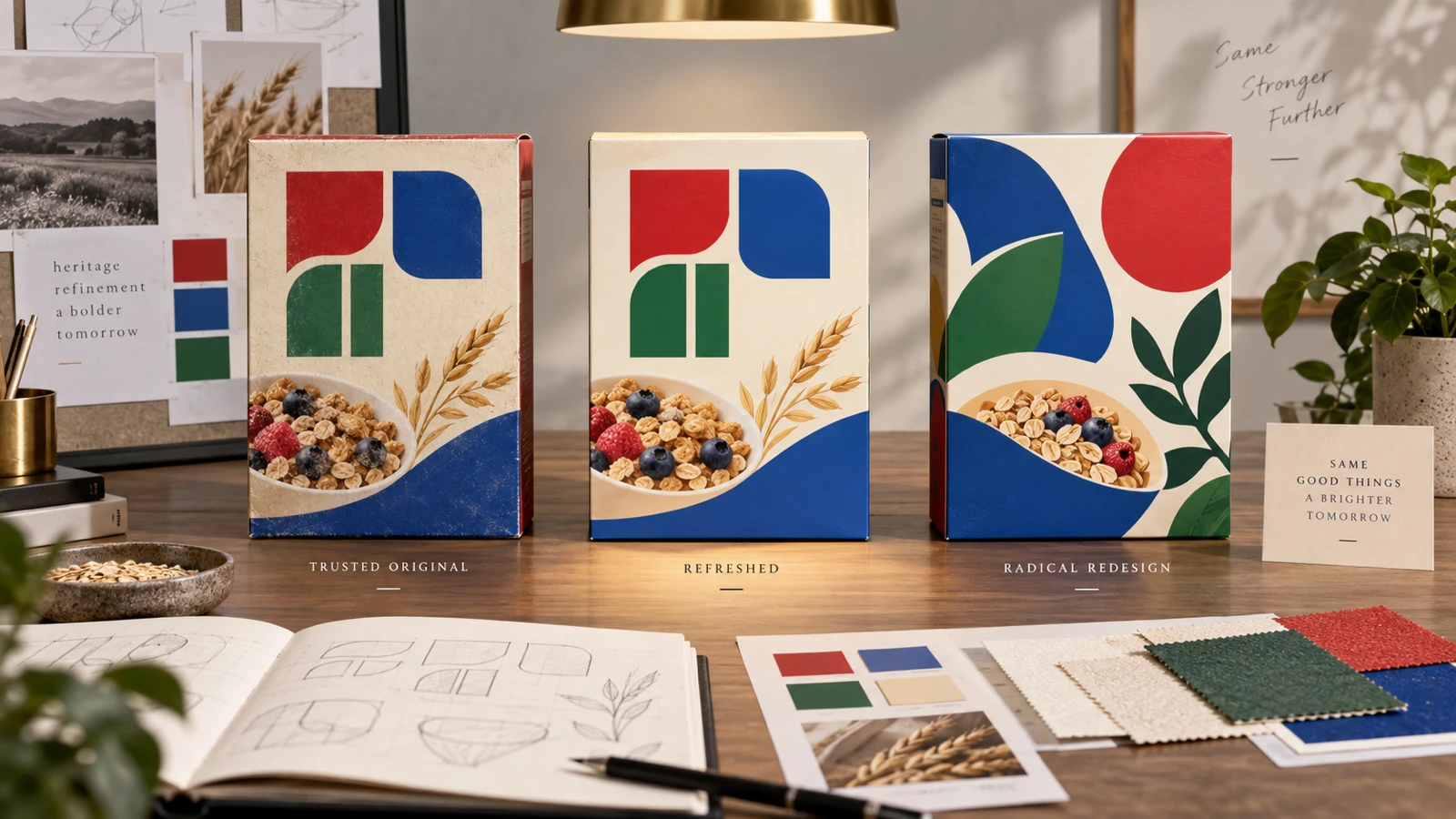
A well-known peanut butter brand with roughly 70 years of shelf recognition recently updated its identity — and if you weren't paying close attention, you might not have noticed. The classic red, blue and green blocked wordmark stayed almost entirely intact. Designers simply removed a drop shadow and softened the serifs, keeping the quirky lettering that generations of customers already recognise on sight.
That restraint is the whole story. It's a textbook example of a refresh rather than a redesign — and understanding the difference could save your business from an expensive branding mistake.
Refresh vs. Redesign: What's Actually Different
A redesign starts from a blank page. The logotype, colours, and sometimes even the name itself are open for reconsideration. It's appropriate when a brand has a real problem: it looks dated in a way that hurts credibility, it no longer reflects the business, or it was never done well in the first place.
A refresh keeps everything that's already working — the shapes, colours and structure customers already recognise — and quietly modernises the execution: cleaner linework, better proportions, updated production quality. Nothing about it should feel new. It should feel like the same brand, just sharper.
Why Brands With History Choose Refresh Over Redesign
Decades of recognition is an asset that a full redesign puts directly at risk. Every year a logo sits in front of customers, it accumulates equity — the instant, subconscious recognition that no new design can replicate on day one. A refresh protects that equity while fixing whatever specific element (a dated shadow effect, an inconsistent serif, a colour that doesn't reproduce well digitally) was actually the problem.
This is precisely the calculation a long-running brand makes when it opts to expand what its identity can do — new taglines, new applications, new content formats — while leaving the core mark itself almost untouched.
How to Tell Which One Your Business Needs
- Choose a refresh if: customers already recognise and trust your current logo, but it feels technically dated — clip-art effects, poor spacing, a font that doesn't render well on screens.
- Choose a redesign if: your logo doesn't reflect what your business actually does anymore, was poorly executed from the start, or is actively working against how you want to be perceived.
- Choose neither if: the logo works fine and the itch to change it is coming from boredom, not a business problem. Consistency has real value — don't spend money undermining it.
The Small Business Version of This Lesson
You don't need 70 years of history for this principle to apply. Even a business three years in has some accumulated recognition worth protecting. Before commissioning a full redesign, ask a designer whether a more targeted refresh — better files, tighter spacing, a modernised colour value — would solve the actual problem. It's often faster, cheaper, and less risky than starting over.
Not sure if you need a refresh or a full redesign?
Send us your current logo and we'll give you an honest recommendation — no pressure to redesign if you don't need to. Packages start from $29 with a 100% Money Back Guarantee.
See Packages