

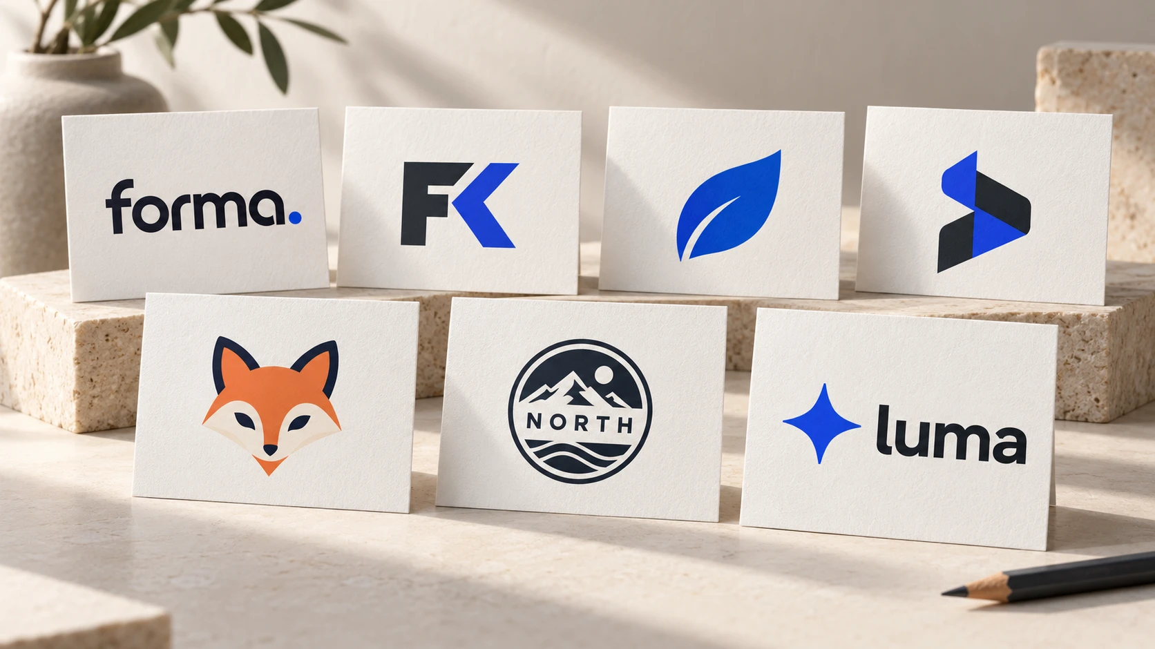
Short answer: there are seven main types of logos — wordmarks, lettermarks, pictorial marks, abstract marks, mascots, emblems and combination marks. For most new and small businesses, a combination mark or a wordmark is the safest choice, because both put your name in front of customers while they are still learning who you are.
Before a designer draws anything, it helps to know which kind of logo you are asking for. The type you choose affects how readable your logo is at small sizes, how quickly people learn your name, and how well the design stretches across a website, a shopfront and a social media avatar.
The 7 Logo Types at a Glance
| Type | What it is | Well-known examples | Works best when |
|---|---|---|---|
| Wordmark | The full name in styled lettering | Google, Coca-Cola, Visa | Your name is short and distinctive |
| Lettermark | Initials or a monogram | IBM, HBO, NASA | Your name is long |
| Pictorial mark | A recognisable picture or icon | Apple, Target | You already have name recognition |
| Abstract mark | A non-literal shape | Nike, Pepsi | You want a unique, ownable symbol |
| Mascot | An illustrated character | KFC, Michelin | You want warmth and personality |
| Emblem | Text inside a badge or crest | Starbucks, Harley-Davidson | You want a traditional, established feel |
| Combination mark | Symbol plus name together | Adidas, Lacoste | You want flexibility — the usual choice |
1. Wordmark (Logotype)
A wordmark is simply your business name, set in a carefully chosen or custom-drawn typeface. There is no symbol to explain — the name is the logo.
Good for: short, memorable names and new businesses that need people to learn the name quickly. Watch out for: long names, which become hard to read when small. Because everything rests on the lettering, font choice matters enormously.
2. Lettermark (Monogram)
A lettermark reduces a long name to its initials. It is compact, tidy and works well in small spaces such as app icons.
Good for: businesses with long or hard-to-pronounce names. Watch out for: initials mean nothing to people who have never heard of you, so new businesses often pair a lettermark with the full name underneath for the first few years.
3. Pictorial Mark (Logo Symbol)
A pictorial mark is an icon based on a real, recognisable object. It is what many people picture when they hear the word "logo".
Good for: established brands and businesses whose name suggests an obvious image. Watch out for: a picture alone does not tell a stranger your name. It also needs to stay relevant if you expand beyond what the picture shows.
4. Abstract Mark
An abstract mark is a geometric or freeform shape that does not depict anything literal. Because it is invented, it can be completely unique to you.
Good for: businesses offering several products or services that no single picture could represent. Watch out for: meaning has to be built over time through consistent use, and colour and form have to do all the emotional work.
5. Mascot
A mascot logo features an illustrated character that represents the brand. Mascots are friendly, approachable and give you a "spokesperson" to use in marketing.
Good for: food businesses, sports teams, children's products and brands that are active on social media. Watch out for: detailed characters lose clarity at small sizes, and can feel too playful for serious industries. We look at this in detail in should your small business have a mascot?
6. Emblem
An emblem places the name inside a shape — a badge, seal or crest. The text and symbol are inseparable.
Good for: cafes, breweries, schools, clubs and any business wanting a sense of heritage and craftsmanship. Watch out for: emblems are the least flexible type. Small text inside a badge can become unreadable on a phone screen or when embroidered.
7. Combination Mark
A combination mark pairs a symbol with a wordmark, side by side or stacked. People see the name and the symbol together, and over time the symbol can be used on its own.
Good for: almost any business, especially new ones. Watch out for: very little — just make sure your designer supplies the symbol and the name as separate files as well as together.
Which Type of Logo Is Best for a Small Business?
If you are unsure, use these rules of thumb:
- New business, nobody knows your name yet: choose a wordmark or combination mark. Name recognition comes first.
- Long business name: a lettermark, or a combination mark with a compact symbol for small spaces.
- Mostly seen on apps and social media: make sure there is a simple symbol or initial that works in a tiny square.
- Trading on tradition or craft: an emblem, with a simplified version for small sizes.
- Selling to families or building a social following: consider a mascot.
Whatever you choose, the fundamentals do not change. A logo still has to be simple, memorable and versatile — see what makes a good logo for the five principles.
Frequently Asked Questions
What is the most common type of logo?
The combination mark. It gives a business both a readable name and a symbol it can use separately later.
What is the difference between a wordmark and a lettermark?
A wordmark spells out the full name; a lettermark uses only the initials.
Can a business use more than one type?
Yes. Many brands have a primary combination mark plus a symbol-only or initial-only version for small spaces. This is normal and good practice, provided the versions clearly belong together.
Which logo type is easiest to trademark?
That depends on how distinctive the design is and on the law where you trade, not on the type alone. Unique, original artwork gives you the strongest starting point; for anything beyond that, speak to a trademark professional.
Not sure which type suits your business?
Tell us about your business and our designers will present original concepts in the styles that fit. Packages from $29 with unlimited revisions and a 100% Money Back Guarantee.
See Packages